

WELCOME to the ‘1st of the month’ blog post for February 2015!
If this is your first time here, thanks for visiting, before you do anything else, I recommend you download my IM business cheatsheet:

The cheatsheet reveals my 4 PROVEN passive income strategies, and how you can get started with each one.
In today’s blog post I’m going to share a case study with you about how this website went from ‘old-and-outdated’ to fresh, more functional, and ‘lead optimized’.
We’ll dive into all the gory details including:
- How much the new design cost
- How I turned the design into a WordPress theme
- The mistakes I made
- How long it took
- And how YOU can transform any website you own
If you want to download this post in PDF format so that you can read it later, click the button below:


I’ve said over and over again that for me Internet Marketing is all about lifestyle, financial freedom, and flexiblity. They are the three underlying things that drive me to continue to grow my business, and I’m always seeking that perfect work-life balance.
Four weeks ago my wife and I shifted to the French Alps.
We rented a ‘ski-in/ski-out’ apartment in a town call Morzine, right on the border of Switzerland and France, about 1 hour from Geneva.
Apart from the fun and excitement of living in a ski-town for a month, being here has allowed me to once again reflect on WHY I love this business model…
Internet Marketing really can give you complete freedom in every sense of the word.
Here are a few pics from the past month:
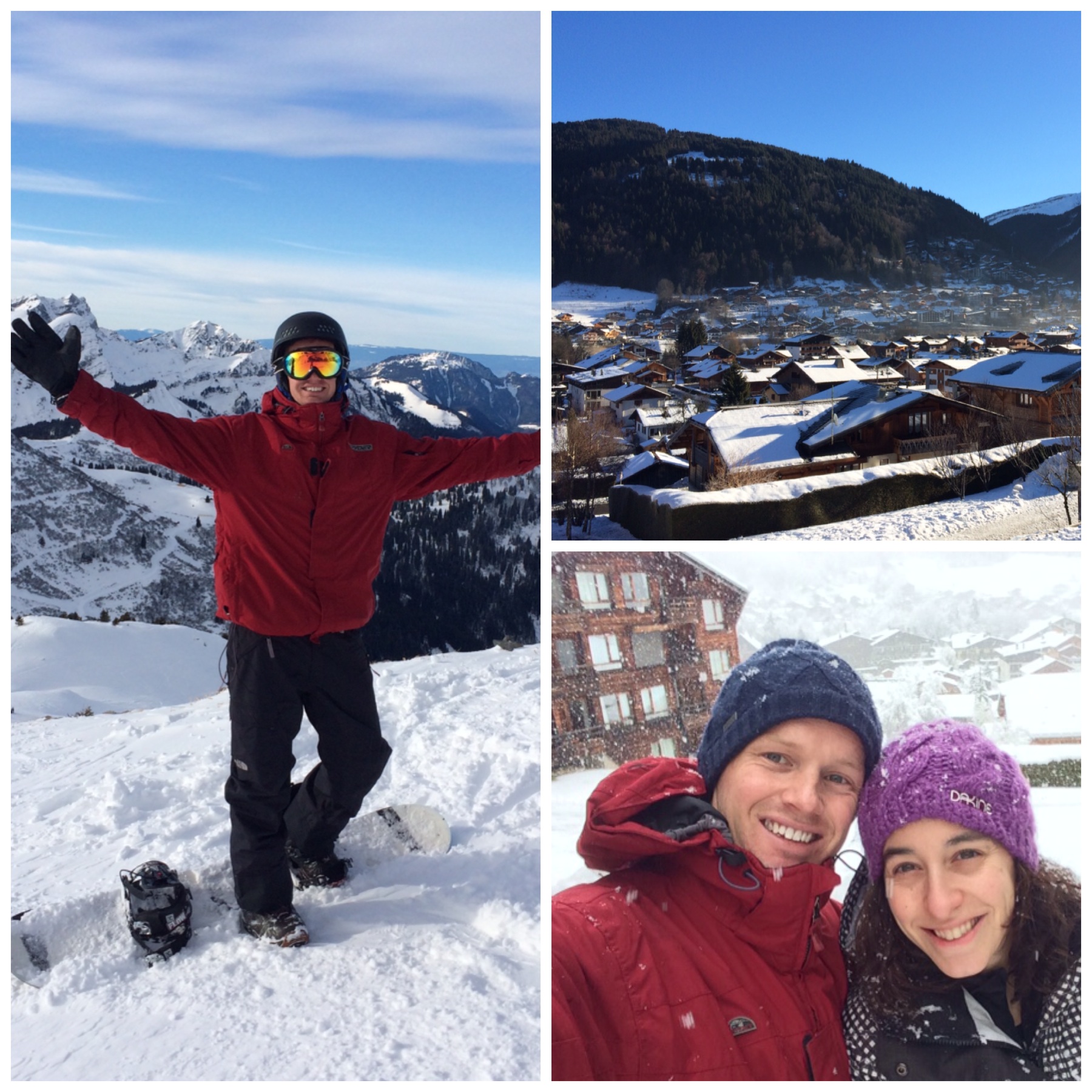
One of the first things I did when I got here was head up the mountain with my snowboard to THINK about what I wanted to achieve in 2015, and put a plan in place to hit my goals.
I sat down in a quiet (extremely isolated) restaurant, and plotted my course for 2015.
I scribbled everything down in a notepad, then condensed my goals into 5 succinct points.
I had a rough idea of my “New Year Resolutions” before 2015 began, but having the time, space, and silence to allow my mind to ‘re-group’ and lay out a plan has really helped me to start 2015 in the right frame of mind.
If you haven’t set your goals yet, it’s not to late… take a stab at getting something down on paper today.
If you want to find out more about how to set goals, check out this blog post I wrote a few weeks ago.

My hope is that after you’ve read this case study, you’ll see how YOU can implement a dramatic website make-over on a low budget, even if you’ve got no prior design or technical experience.
You’ll be able to see what’s possible, so you can make your own mind up on whether it makes sense to give any of your websites a makeover.
You’ll also understand why a make-over for AidanBooth.com was a no-brainer, it goes far deeper than just an aesthetic change.
And I also hope you’ll see how to truly optimize a blog/website for subscriber optins… that alone is a priceless lesson that could earn you a LOT of money.

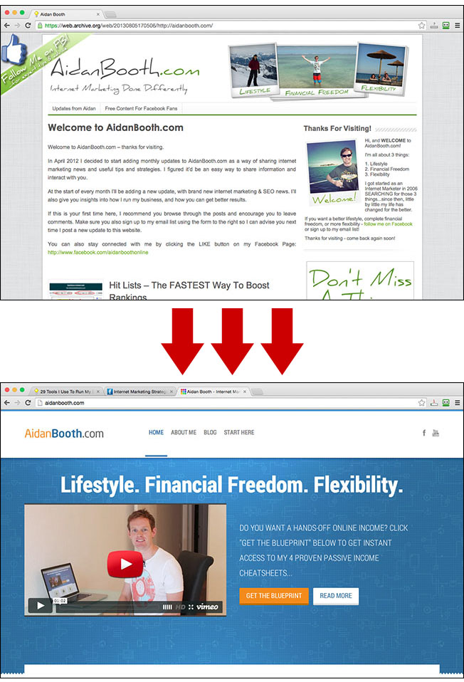
I launched AidanBooth.com at the beginning of 2012 and have been releasing new content related to internet marketing on the 1st of each month ever since.
Since the beginnging of 2012, until the 1st of December 2014, this website had the same design and used the same theme. The theme was called ‘Authority Pro’.
Authority Pro was a GREAT WordPress theme, in fact, it still is a great theme (the developer of it is a coding genius and good friend of mine who I saw recently in Barcelona).
But the Authority Pro theme was no longer optimized for what I needed:
- The theme was no longer up-to-date to opimize lead capture (to get new subscribers from the website)
- The design I was using was getting a bit outdated
- The design was not responsive for mobile devices
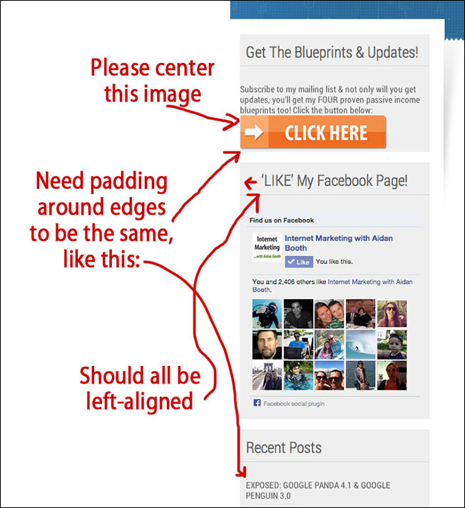
- The site was dis-organized and confusing for new visitors, without an obvious “Start Here” section and without any Social Proof elements
- I had a nagging feeling that the quality of the website design wasn’t on a par with the content on the site
These 5 factors finally convinced me to make a change, which is when I embarked on giving AidanBooth.com a complete top-to-bottom makeover.

The objectives outlined below were designed to solve the 5 problems mentioned above, and take the site to the ‘next level’ in terms of it’s look, feel and usability:
- Make it as EASY as possible for a subscriber to opt-in (lead generation)
- Bring the design up to match the quality of the content
- Portray professionalism the moment someone lands on the site (which in turn helps with opt-ins)
- Be responsive (mobile friendly)!
- Give visitors an easier navigation system so they can find things easier
- To provide information about my internet marketing products
- To integrate other media channels (Facebook, YouTube)
- To display testimonials and social proof (important for new visitors)
I’ll now dive in to how each of the objectives was met, you’ll see how you can apply a lot of this to your own websites (regardless of the niche they’re in).

The first big objective was to increase the percentage of people who opt-in to my AidanBooth.com mailing list.
I tackled this problem in three ways:
- Increasing the number of places a visitor can subscribe
- Increasing the effectiveness of each optin area
- Improving the optin bribe (the reason people subscribe)
Let’s now take a look at each of these in more detail:
![]()
Boosting optin rates depends on a few things, the first of which is just ensuring that you’re giving people enough obvious places to opt-in to your email series.
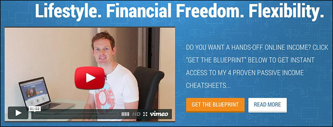
I approached this by increasing the number of places visitors could subscribe. At the time of writing, the homepage has three different optin button locations.
The first is right next to the video at the top of the homepage (“Get The Blueprint”):
The second is at the bottom of the homepage content:
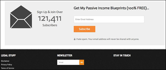
And the third in the footer section:

![]()
The blog posts have a different layout to the homepage, and need to be optimized slightly differently.
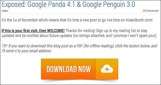
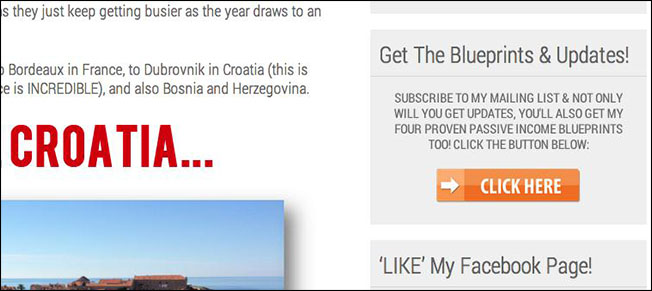
Because of the length of my blog posts, and the fact I have a sidebar on the blog posts, I’m able to include a minimum of 4-5 different optin locations as shown in the images below (taken from my ‘1st of November, 2014’ blog post).
The first optin location is at the very top of the page, the big orange ‘Download Now’ button:
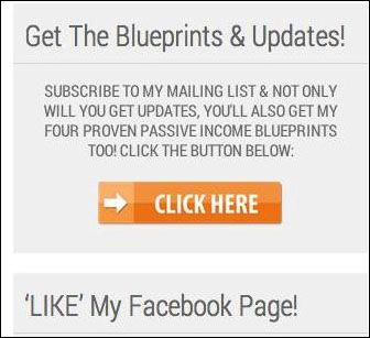
The image below shows the sidebar optin button, again, a highly visible orange ‘Click Here’ button:
Further down the blog post I again include another LeadPages powered in-content optin button:
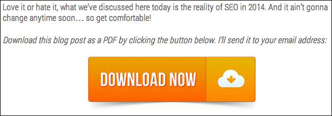
And then at the end of the post you’ll see a ‘Like what you’ve read’ box (also powered by LeadPages), this appears on ALL blog posts site wide:
And like the homepage, posts also have two final optin locations. The end of page subscribe box, and also in the Footer Section newsletter signup box:
As you can see, this particular blog post had SIX optin locations. None of them are too ‘in-your-face’, and if someone doesn’t want to subscribe, they can just ignore them. If they DO want to subscribe though, it’s easy to do it.
So that’s how I (comprehensively) increased the number of optin locations! Let’s now move on to the next subscriber improvement focus…
![]()
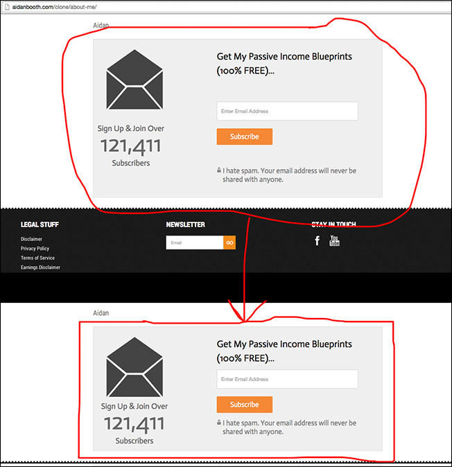
Getting more subscribers is not just about having more optin forms though, it’s also about how you use the optin forms that you’ve set up.
Since I started experimenting with LeadPages about a year ago, I’ve come to the conclusion that signup BUTTONS perform much better than signup FORMS.
Here’s an example of what my sidebar used to look like (using a signup FORM), and what it now looks like (using a signup BUTTON).
Old Sidebar Signup Form:
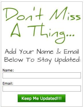
New Sidebar Signup Button:
The button performs a lot better than the traditional optin form.
I don’t have any exact data as to why this is, by my theory is that people are already used to seeing optin forms and tend to ignore them (it’s a bit like the ‘banner blindness’ phenomena).
This factor, combined with the psychological impact of having someone click to say they want something, and THEN asking them for information, leads to a higher optin rate (they’ve indicated they want it, so to then NOT ask for it is a bit like changing their mind, which people do not like to do).
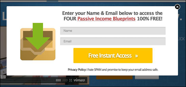
When someone clicks on any of the optin buttons on this site, it creates a popup that then asks for the visitors email address.
Here’s what the popup looks like:
![]()
Needless to say, I’m a HUGE fan of LeadPages because they simplify my email subscription boxes,
and ultimately they make my websites more profitable.
If you don’t already use LeadPages, I highly recommend that you check out my LeadPages demo video and the bonus pack I’ve set up for it: https://aidanbooth.com/lead-pages-bonus
Now let’s talk about the 3rd and final optin conversion optimization factor, the BRIBE.
![]()
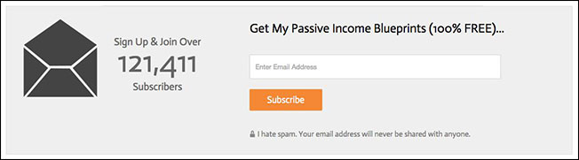
The third component that I spent a lot of time focusing on was the REASON people sign up.
In the past, the ‘Bribe’ (or reason to sign up) was simply to “stay up to date”, which is a TERRIBLE attempt to get someone to opt in to a mailing list (especially for new visitors).
With the renovation of AidanBooth.com, I wanted to correct that. I thought long and hard about what I could create for my visitors that would appeal to them.
I came up with a blueprint that reveals ‘4 Proven Passive Income Cheatsheets’. The blueprint I created explains a high-level step by step system for each monetization method.
Side Note: The feedback I’ve received so far about this new report has been awesome, so it appears to be doing the job nicely!!

Since implementing the three initiatives, optin rates have more than quadrupled. That in itself made the cost of this entire ‘experiment’ worthwhile.
I’ll talk more about how the subscription rate effects income further down this post, but first let’s take a look at the design process I used when giving this site its makeover…

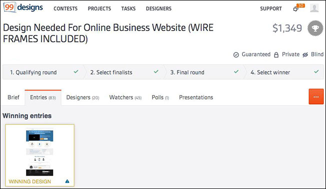
The new design of AidanBooth.com was created by a designer on 99Designs.com. We’ve been using 99 Designs for image creation for our business since 2009, and it’s proven itself time and time again.
If you haven’t used 99 Deisgns before, the process is quite simple:
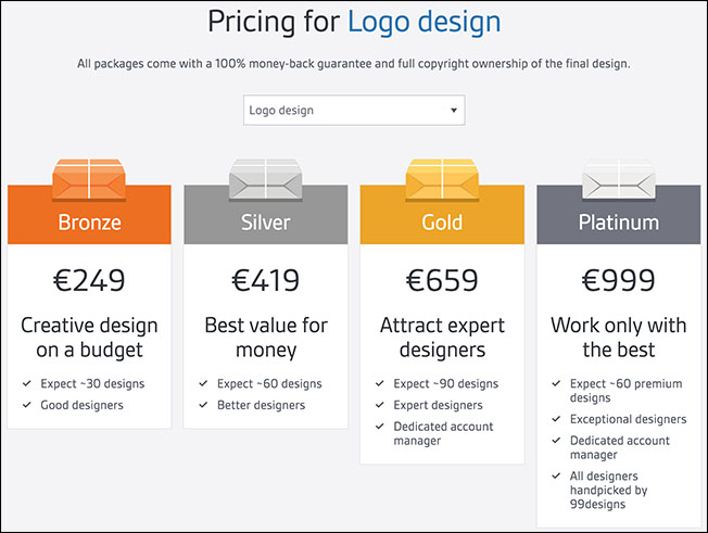
First you choose what type of design you need, then you choose your price.
Different designs cost different amounts. Below you can see the logo pricing, and the different tiers available:
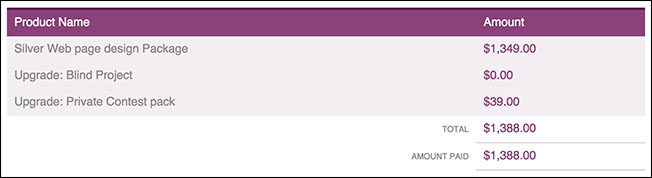
Website designs are a bit more expensive than logos, and my project ended up costing me $1,388. I chose the silver package and also made it a private contest (meaning each designer can’t see the other designers work, this helps get more unique ideas):

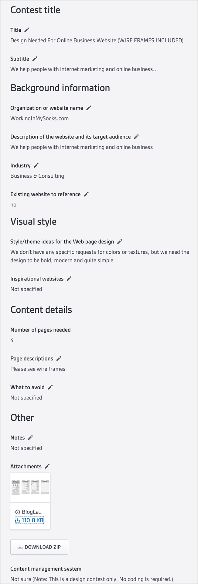
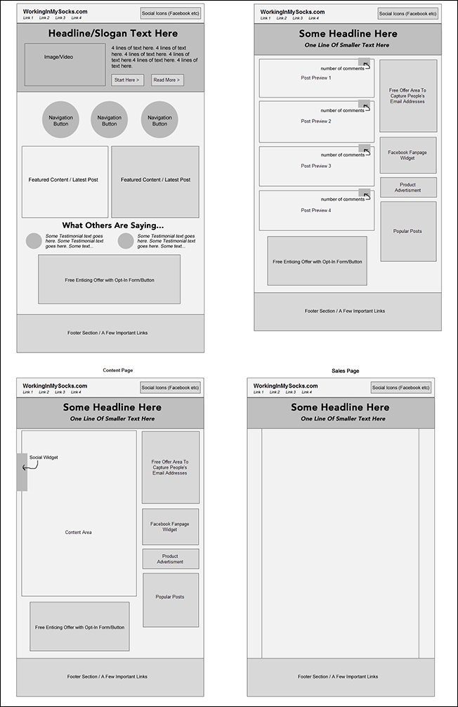
The project brief was simple, I didn’t overcomplicate things by giving too many specifications, and I gave an idea of what I thought a good website would be using a simple wireframe.
Here’s the brief:
NOTE: In the brief above and images below, you’ll see we set ‘WorkingInMySocks.com’ as the domain name. When this design was created, it was originally going to be used on a different project, but we decided it’d be better suited to AidanBooth.com.
And here are the wireframe images:

The project resulted in 83 designs, by 20 different designers.
Here are a few of the designs that I loved, but ultimately didn’t choose:
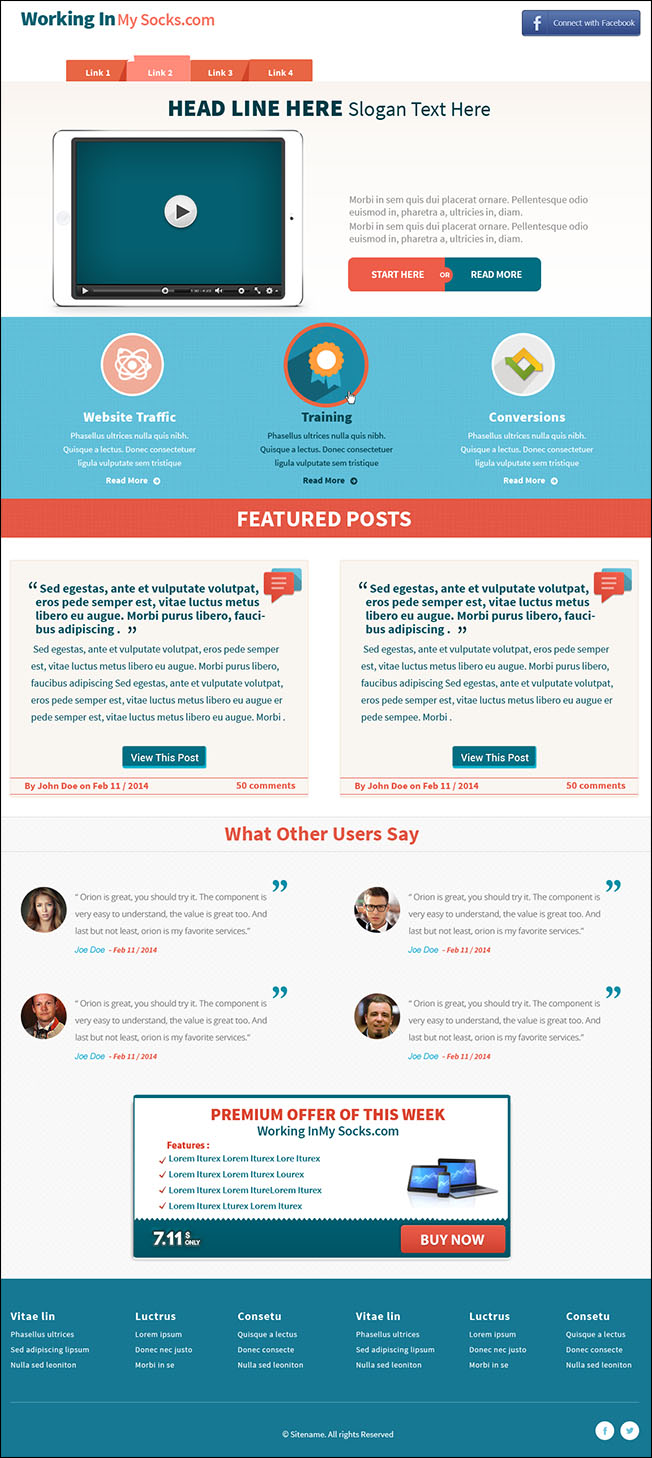
I loved the colors in the design above, but wanted something that reflected the more of the ‘Blueprint’ theme that we associate with out business branding.
Here’s another design that was submitted:
As you can see, it’s another professional design that could have worked really well.

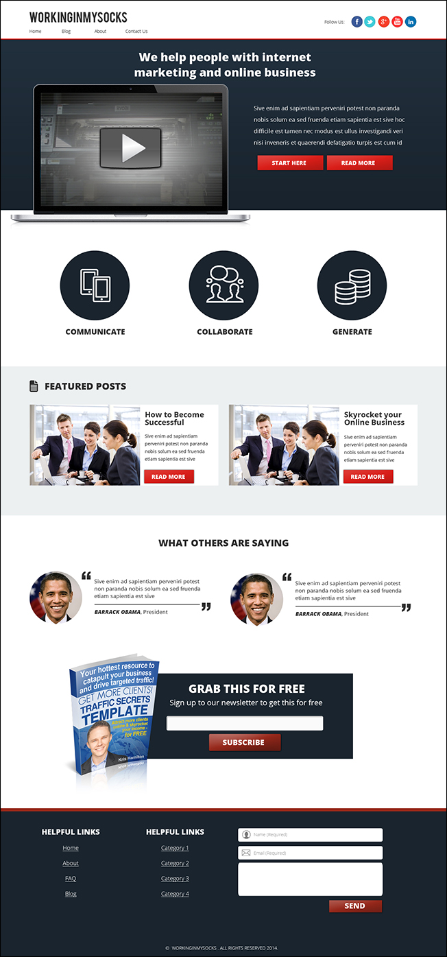
The winning design is what this website is now. Several different tempaltes were created for different pages, you can see them by clicking the links below:
Homepage Template: https://aidanbooth.com
Blog Page Template: https://aidanbooth.com/no-niche-no-problem/
Category Page Template: https://aidanbooth.com/category/updates-from-aidan/
Two Thirds Template: https://aidanbooth.com/about-me/

Once the design was completed, it was time to take that static image and turn it into a website that’d work. This job needed to be done by a coder/developer, NOT a designer.
In addition to transforming static images into a working website, the developer needed to make the website responsive, in other words, to make it resize itself dynamically for mobile devices, smaller screens, tablets etc.
It ALSO needed to run on WordPress.

First I hired a coder on Elance. This coder said he could do the job for $383, and within a week… three weeks later the project was still not finished.
It turned out that we had a serious misunderstanding of what was required and the designer ended up admitting that they couldn’t do the project, and I wasn’t charged anything.
The lesson here was that I was not explicit enough on exactly what was needed. The developer should have clarified things with me before starting the project, but I ALSO should have clarified that he understood… it would have saved me three weeks of wasted back-and-forth communication.
After the Elance failure, I handed the job over to one of our full-time in-house developers, and he finished the job.

Whenever I’m using developers or designers from non-Western countries, I find it much more effective to use visual images to show what I need, this was the case with this project.
Below you can see a few images that I sent to developers when they needed to tweak designs:
Here’s another example:
After some back and forth, the website was complete.

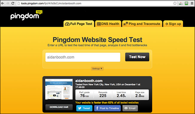
Before making any changes, I tested the load speed of the old site, here are the results:
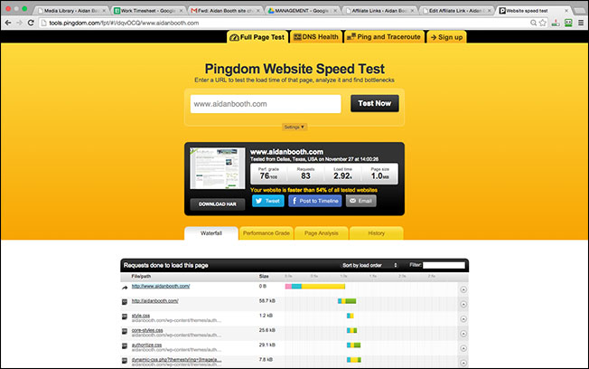
After switching over to the new design, here was the initial load speed:
As you can see, the new design was loading almost TWICE as slowly as the original site… NOT good…
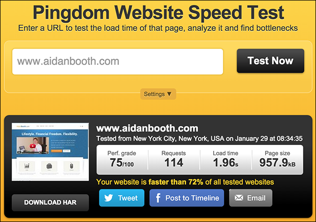
I then installed a free caching plugin called ‘WP Super Cache’, here are the new load speed results:
As you can see, the timestamp in the test above is just 4 minutes AFTER the previous test. The ONLY change I made was to install WP Super Cache, and the reuslt was that the load time was slashed to less than the original site.
![]()
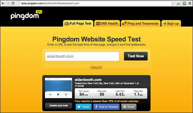
In the past week I’ve switched the hosting of this website from HostGator to Rackspace. I’ve noticed the performance of HostGator deteriorate over the past year or so, and it was beginning to affect the performance of this site.
The traffic this website gets on the 1st of each month was causing the site to go down, HostGator was not coping well. Rackspace should be fine though.
Here’s the speedtest results since I’ve switched to Rackspace:
Let’s now dive into the numbers, and if this was a smart financial decision or not…

Making this website design change cost me $1,388.
Let’s assume that at a BARE minimum this design makeover increases subscriptions by just FIVE extra subscribers per day. That’d be 1,825 EXTRA optins over the course of a year.
And lets say that each subscriber is worth $1/year, that’d result in $1,825 over the course of a year.
In reality, subscribers are worth much more than $1/year, so this number is massively under what the real number would be, but it highlights why this change easily pays itself off.
And it’s not JUST something that we’ve done in the internet marketing niche… we’ve since rolled out changes on a number of our important niche marketing affiliate sites and we’re seeing similar improvements – it absolutely DOES pay off.

Let’s assume you want to give one of your websites a make-over and cash-in on the extra subscribers, improved usability, and overall upgrade in professionalism.
You could make the change for a fraction of what we paid…
In fact, you’d be able to get an extremely good custom design for $400 (or even a lot less), and it’d cost you $200 or less to turn that design into a working website.
Your total cost would be $600 (MAXIMUM).
If doing a change like this resulted in just 1-2 extra subscribers per day, then it’d absolutely be worth it.
And this doesn’t take into consideration the extra affiliate sales you could make…
And what about White Label and selling products on Amazon?
We’ve also upgraded our ‘brand’ websites and are seeing similar performance improvements.
You don’t need to spend $1,388 like we did, because you can do this kind of thing for a MUCH lower price if you already have an idea of the design you need, or if you hire a designer through Elance directly (not 99Designs.com).
To learn how to set up a job on Elance, check out my Elance Case Study.

You can download the PDF for this blog post and/or Passive Income Cheatsheet by clicking the button below!
TIP: See what I just did? Encouraged a reader to opt-in 🙂 Provide real value and you can do this too!

I’d love to know what you think about the new design of this website, and am happy to answer any questions you may have!
Leave a comment below 🙂
Thanks for reading,
Aidan


Nice work, Aidan. Kudos!
Thanks Don!
Interesting stuff Aidan! As a long time visitor, I was very much used to your old design, but I must say, this new one is sharp! I’d love to hear more about how you’ve applied this kind of design upgrade to non-IM websites. Thanks for this!
Hi Jessy, thanks for the feedback. We can definitely dive into the non-IM stuff, maybe in a few months time (I have other blog posts planned already for the next couple of months!)
Love the new design, and I’m surprised it cost you $1300. I would have thought something like this would have cost a lot more!
Hi Al, 99Designs is a pretty cost effective solution for high quality work. And as I mentioned, you could do this kind of thing for half the price (or less). There’s a LOT of talent out there who are looking for work 🙂
Hi Aidan, great case study, thanks! The pingdom data is really interesting. I quickly checked one of my websites, and I have a load time of 4 seconds. I already have a caching plugin installed, is there anything else I can do to improve this? Jerry
Hi Jerry, check the pingdom report, it’ll show you where your ‘slow spots’ are, and you can work on them. Also, if you’re not using the Super Cache plugin, I recommend you try that one, that’s the one I use on this site.
Great content. Your website dose look better and the opt in boxes are really standing out. I think the price is right if you find somebody in the states to do the job for you. I think I would do these improvements for 1000$, but I am sure that you can outsource this in india or other countries for a cheaper price.
Thanks for the feedback!
The site looks great, but I have a few questions.
1. Doesn’t using images for your headers affect SEO? From what I can see in the source code, the only headers you are using are for your main article title.
2. Sketch Mini is a pretty old theme. Maybe they keep it up to date, but from the looks of sketchtheme.com they haven’t even updated their copyright footer since 2012. Just an observation.
Despite that, it looks good to me! Thanks for the case study.
Hi Mike, glad you like it!
Yes, using images for SEO does impact things in a couple of ways, but it’s not necessarily a bad thing. All my header text images are unique, so they don’t do any harm. Also, I don’t target specific keywords when I do my posts (something I SHOULD be doing), after 3 years this site (thankfully) gets lots of organic searches for a wide range of keywords 🙂
Regarding SketchMini – it’s only used as the base… our developers have changed a lot of things. What’s important is that it was easy to use to create the design we needed.
Thanks for commenting Mike!
Hi Aidan, in my opinion it’s a fantastic improvement. I noticed quite some time ago that your old design was NOT optimised for mobile. What a difference proper mobile optimisation makes! Be sure to take a “before” and “after” snapshot of your mobile phone and tablet device data from within Google Analytics. I’m betting you’ll see some big reductions in bounce rates over the coming few months
Hi Bruce, thanks for commenting, I appreciate your feedback!
The mobile responsive thing has definitely lowered bounce rate (it’s also a combination of the more professional and “up-to-date” look) 🙂
Great blog post mate, enjoyed reading it.
Hey Danny, hope you’re doing well buddy! I’ll be in London later this year, so we should catch up 🙂
Great post!!!
For psd to wordpress, we use xhtmlchop, the followup and delivery is very good.
About hostgator, I agree, it is the result of this huge company named endurance that has been buying all the hosting companies bluehost,hostgator, 50 more companies And streamlining them but not keeping a good level of service.
The service of HostGator has dropped majorly… you’re right, they’re streamlinging things, but the old-fashioned customer service has deteriorated. Thanks for commenting Claudio!
Nice one Aidan,
Would be interested to see what you recommend for a physical product (white label) company/product website design!
Sure thing Carrick, I like that idea… I’ll work on something 🙂
I second Carricks idea, would be great to see a sample eCom site (for Amazon products).
Congrats on the stunning new design. Much easier to read on my iPhone!!!
Thanks Bryce! I WILL do something with Carricks idea… really like that and can see it’d be useful to people 🙂
Slick website.
Transparency in self-disclosure / contents is refreshing.
Thank you.
You’re welcome Niki!
Aidan,
I like the changes you made- they really stand out. I’m looking to build a website that would direct people to Amazon (where I have products). There’s a new wordpress theme out called “omnipress”. Have you heard anything about this? If not, what would you recommend to build a website?
Thanks,
Bob
Hi Bob, I haven’t actually used that theme but have heard about it. Several people have asked me today about websites for Amazon products, so I’m going to put something together for you soon with different options etc 🙂 Thanks for the feedback!
Great job as always Aidan.
Thanks Mark!
I really like the new look, congratulations, Im sure you worked hard on it. For the LeadPages pop-ups, do you know if there is another tool that can do the same thing, perhaps for a one-time fee instead of monthly? Thanks!
Hi Shelly, I’m not sure about alternatives to LeadPages, I’m sure there are many options out there nowadays though. Perhaps popup domination (although I’ve never actually used it myself).
Looks great, Aidan! Very professional looking, and I love the graphics and layout just for this post … it’s always great seeing some “behind the scenes” reporting. However, since I’m already signed up to your mailing list, I can’t get the pdf, lol!
Hey Chris, thanks for the feedback! You SHOULD be able to get the PDF… shouldn’t matter that you’re signed up… should still work… if this isn’t the case, let me know!
It works! I must have clicked the Cheatsheet
Glad you got it sorted! I was worried for a minute. This is a cool leadpages feature, that allows people to sign up to receive something EVEN if they’re already on the list 🙂
The new design is great! Thanks for documenting everything so clearly, I feel I could implement this on my own sites now. BTW, I’ve just joined your FB page
Leadpages is out of my budget right now. Do you recommend an alternative? I’m currently using the free MailChimp until I grow my list past what they offer. Can you recommend any plugins or something to where I can add these opt-ins throughout the article and at the end? I currently have one in the sidebar, as well as sumome opt-in bar up top which has been working ok. But as you know, the more spots, the better!
Hi Mike, you can use FunnelizerPro for basic squeeze boxes – you can get this for free using the link in the sidebar. As for pop-ups, I’ll look into it… 🙂